
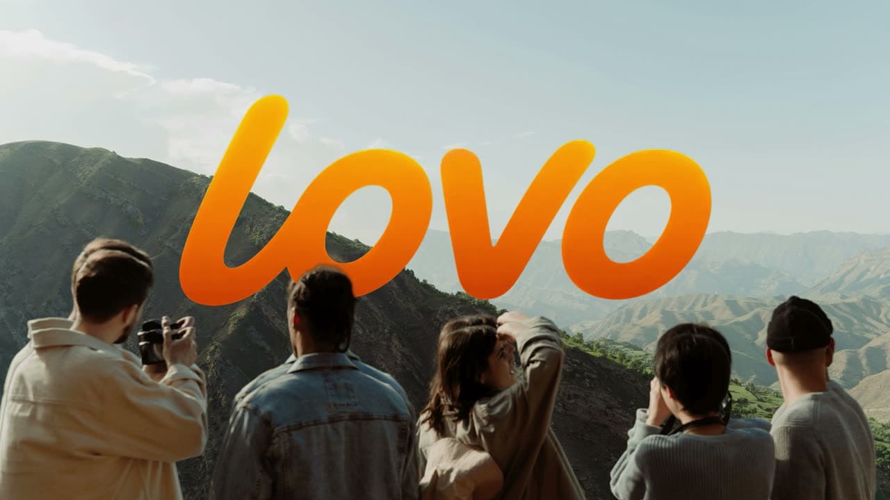
01 · The brief
Real places, shown by real people, instead of a feature list.
- Brief
- Introduce a new travel concept in a short launch film without turning it into a product demo: clear, human and curious enough to leave room for the viewer.
- Our role
- Art direction and motion design.
- Deliverables
- Horizontal launch teaser (16:9)
- Storyboard and story beats
- Visual system: type, labels and interface fragments
02 · Scenes · 5 stills
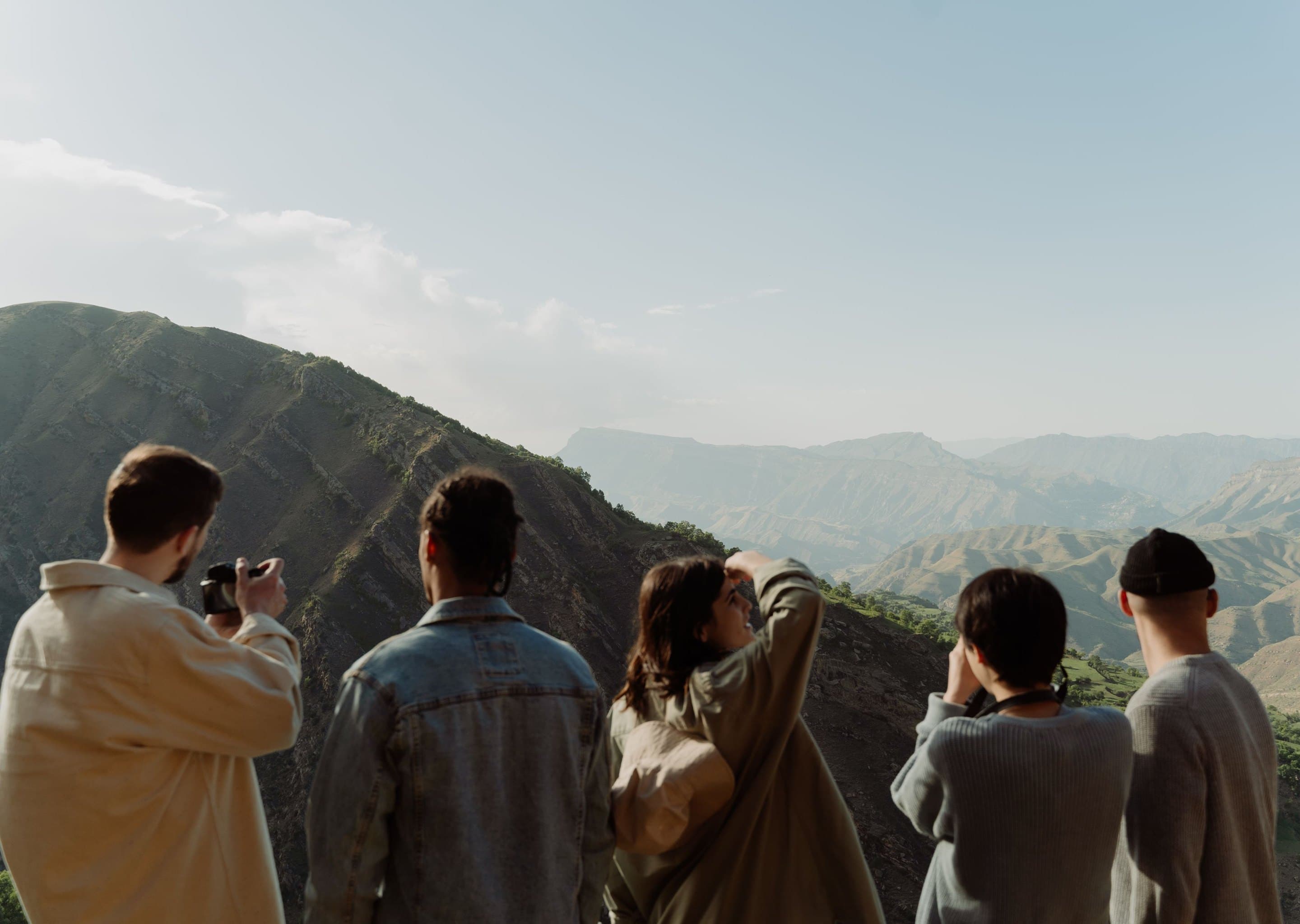 00:00
 00:09
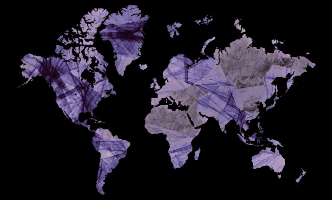 00:18
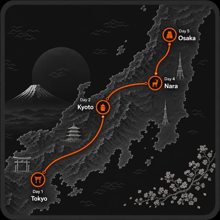 00:27
 00:36
How it was made
03 · Brief
Finding real places through real people.
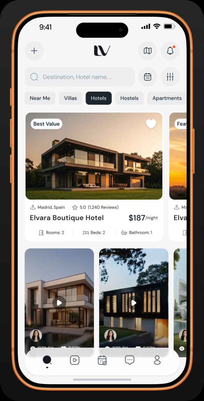
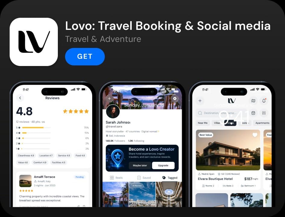
Lovo needed a short launch film that could introduce a new travel concept without becoming a conventional product demo. The challenge was to keep the message clear, human and intriguing while leaving enough space for curiosity.
04 · Concept
From a listing to an experience.
We built the story around one simple idea: a place is more than a listing. Instead of features, the concept turns attention to real people, lived experiences and the human view behind every destination.
05 · Structure
Mapping the teaser.
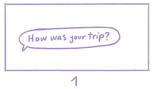
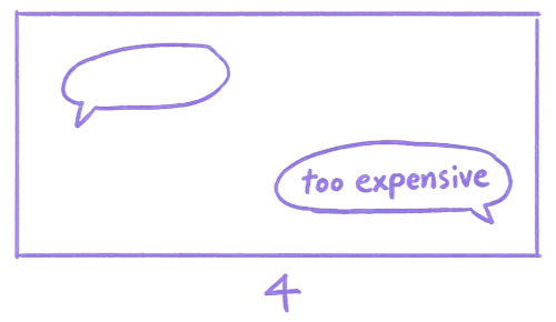
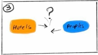
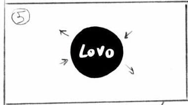
The concept became a clear sequence of visual beats. Storyboards, scene order and timing shaped the journey from search to discovery, connection and invitation.
06 · Language
Building a language for discovery.
We developed a visual system where type, travel imagery, interface fragments, labels and graphic elements work together as one world. The goal was warm, contemporary and editorial rather than technical.


07 · Motion
Making the system move.
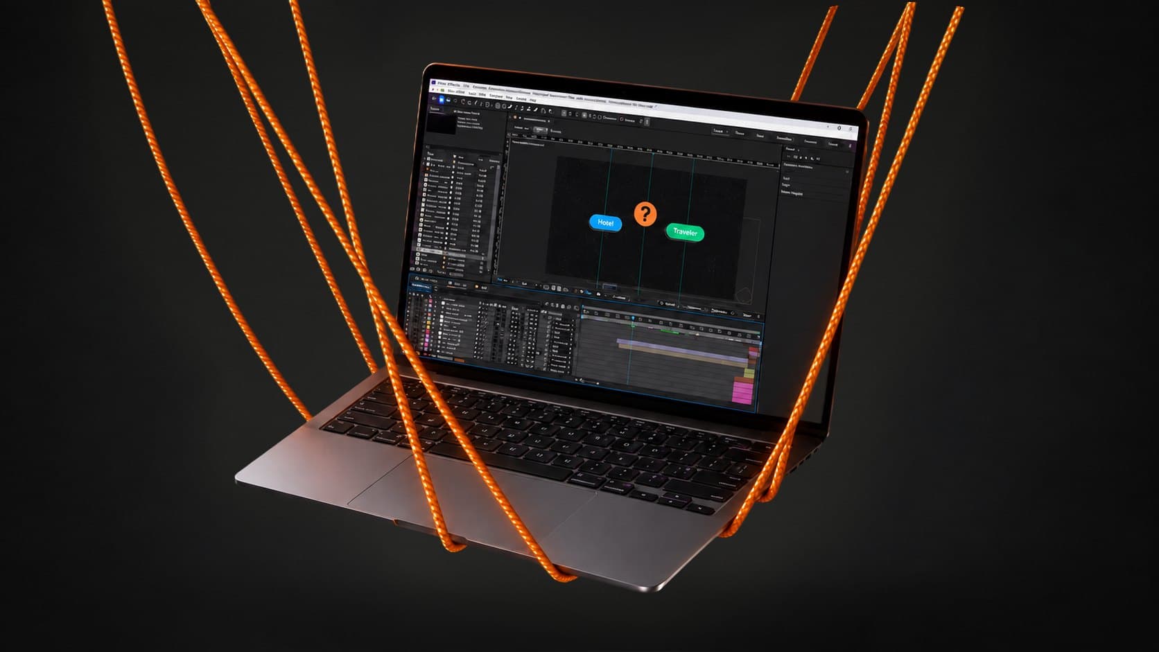
This is where the visual system became motion. Timing, transitions, easing, type, interface movement and connection graphics were refined into a flow that feels structured but still natural and human.
08 · Final
From rough cut to launch film.
The final stage was pacing, transition polish, sound design and rhythm. Every layer was refined until the teaser felt like one continuous story rather than a set of separate scenes.
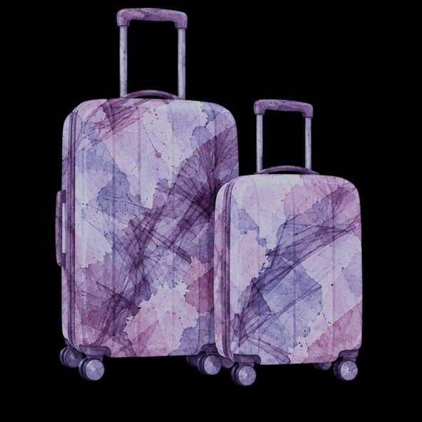
09 · From the same campaign · 3 loops
Three cuts from the same campaign.
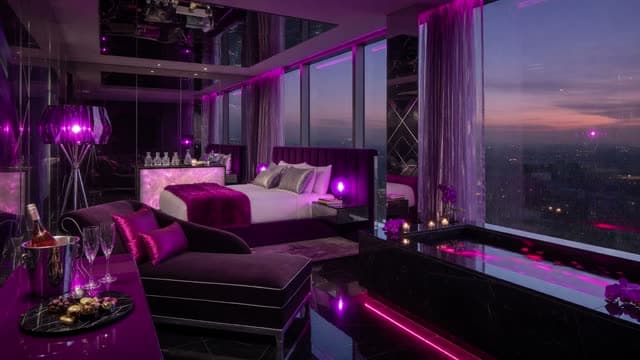
Lovo · Hotel film · Launch film · 0:06 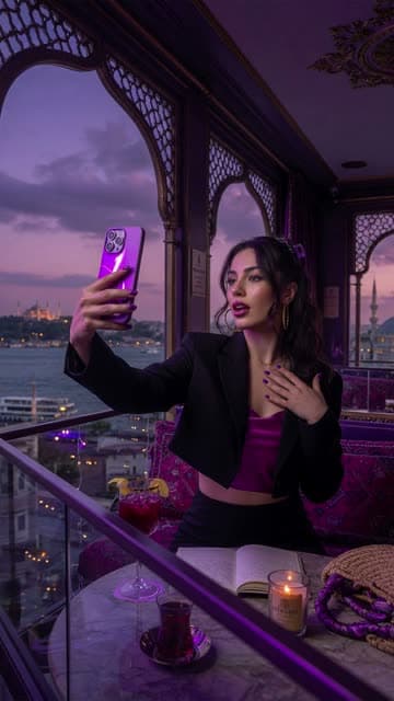
Lovo · Creator cut · Social cut · 0:06 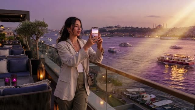
Lovo · Rooftop cut · Social cut · 0:06
10 · Credits
- Client
- Lovo, travel technology
- Studio
- Purple Berry Studio
- Our role
- Art direction and motion design
- Format
- Horizontal launch teaser (16:9), 2026
11 · Next project
All work
A vertical explainer that turns a child’s speech journey into a warm, easy-to-follow story.
Vertical explainer · 1:48 · 2026